Warm vs Cool Paint Colors: Undertones Explained

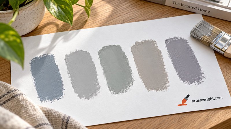
A paint color’s undertone is the subtle hidden color beneath its main color: a gray might lean blue, green or violet, a beige might lean pink, yellow or green, and a white might lean yellow, pink or blue. Warm undertones (yellow, red, orange, pink) make a color feel cozy; cool undertones (blue, green, violet) make it feel crisp and fresh. To see an undertone, compare the chip against pure white paper and against other colors in the same family, look at the darkest color on its paint strip, and test it next to your floors and counters in your room’s light.
Undertones are the main reason a color that looked perfect in the store looks wrong at home. The main color is easy to see; the undertone only shows up next to other colors and under different light, which is exactly what happens on your walls.
Warm, cool and neutral
| Type | Undertones | How it feels | Works well with |
|---|---|---|---|
| Warm | Yellow, red, orange, pink | Cozy, inviting, sunny | Oak, cherry and walnut wood, brass, terracotta, warm whites |
| Cool | Blue, green, violet | Crisp, calm, airy | Gray or white stone, chrome, black, cool whites |
| Neutral or balanced | Very little lean either way | Flexible, quiet | Most finishes; often chosen for whole-house colors |
No color is perfectly neutral; most “neutrals” lean slightly one way. The goal isn’t to avoid undertones but to choose one that works with the fixed things in your room.
Common undertones by color family
| Color family | Common undertones | What it can do on a wall |
|---|---|---|
| Whites | Yellow (creamy), pink (soft warm), blue or gray (crisp, cool) | Creamy whites can look yellow next to bright white trim; cool whites can look stark in north light |
| Grays | Blue, green, violet (cool); brown or beige (warm) | A blue-leaning gray can read as pale blue on a large wall |
| Beiges | Pink, yellow, green | A pink-leaning beige can turn peachy next to a yellow oak floor |
| Greiges | Green, violet, warm brown | Shifts between gray and beige with the light |
| Blues | Green (teal-leaning), violet (periwinkle-leaning), gray (muted) | Purple-leaning blues can look lavender in some light |
| Greens | Yellow (olive, lime), blue (sea green), gray (sage) | Yellow-leaning greens can look sour under cool light |
How to see a color’s undertone
1. Compare against pure white. Lay the chip on a sheet of bright white printer paper. The white background exaggerates whatever the color leans toward: you’ll see the blue in a cool gray, the yellow in a creamy white or the pink in a beige.
2. Compare within the same family. Put several grays, or several beiges, side by side. On its own, a gray looks gray; next to other grays, you’ll see one is bluer, one greener, one warmer.
3. Look at the darkest color on the strip. Paint strips usually run the same undertone from light to dark. The darkest chip shows it most clearly: a gray strip that ends in a deep blue-slate tells you the light gray at the top leans blue too.
4. Compare to a “true” color. Hold a beige next to a clear yellow and a clear pink, or a gray next to a true blue and a true green. The one it looks closest to is its undertone.
5. Test in your room, next to your fixed finishes. Large samples on the wall, beside your floor, counters and furniture, in morning, afternoon and evening light, are the final word. Our guide to choosing a paint color explains how to test samples properly.
If you have a digital color, the color LRV checker estimates whether it leans warm or cool, along with its LRV, as a quick first filter.
How light changes undertones
Undertones aren’t fixed; light pushes them around.
- North-facing rooms get cool, bluish light that brings out blue, green and violet undertones. Cool grays can look cold and flat; warm colors balance the light.
- South-facing rooms get warm light for most of the day, which intensifies yellow and red undertones. Warm colors can get very warm; cooler colors look balanced.
- East and west rooms change through the day: warm morning light in the east, warm evening light in the west, cooler light the rest of the time.
- Artificial light matters at night. Warm bulbs (around 2700 K) bring out yellow and red; daylight bulbs (5000 K and above) bring out blue.
That’s why the same gray can look like three different colors in three rooms of one house.
Matching undertones to fixed finishes
The things you can’t easily change should guide the undertone:
| Fixed finish | Its undertone | Wall colors that usually work |
|---|---|---|
| Golden oak floors or cabinets | Yellow-orange | Warm whites, greiges with warm undertones, soft greens; avoid pink beiges and icy blue grays |
| Cherry wood | Red | Warm neutrals, creamy whites, deep greens |
| Walnut and dark brown wood | Warm, neutral | Most warm and balanced neutrals, warm whites |
| White oak and light, natural woods | Neutral to slightly warm | Wide range; soft warm whites and balanced greiges |
| Gray-washed floors, cool stone, marble | Cool | Cool whites, blue- or green-leaning grays |
| Beige or travertine tile | Warm, often yellow or pink | Match the tile’s lean; test carefully |
| Black or chrome fixtures | Cool, neutral | Crisp whites and cool or balanced grays |
| Brass and gold fixtures | Warm | Warm whites, greiges, muted greens |
Hold chips directly against the floor and the counter. If a chip looks muddy, dirty or oddly colored next to a fixed finish, its undertone is fighting it; if it looks clean, it belongs.
Pairing wall colors with trim whites
Trim white is where undertones most often go wrong. A stark, blue-leaning white next to a warm beige wall makes the beige look dingy; a creamy, yellow-leaning white next to a cool gray wall makes the trim look yellowed.
- Warm walls: pair with a soft warm white or a creamy white.
- Cool walls: pair with a crisp, clean white or a white with a slight gray or blue lean.
- Balanced neutrals: most soft whites work; test two or three against the wall color.
Some designers simply use a very clean, balanced white for all trim and ceilings in a house, then choose wall colors that look right next to it. It’s a reliable way to keep a whole house consistent.
Common undertone problems and fixes
| Problem | Likely cause | Fix |
|---|---|---|
| “My gray looks blue.” | Blue undertone, often in north light | Switch to a warmer gray or greige; or a gray with a green or brown lean |
| “My beige looks pink.” | Pink undertone, highlighted by yellow wood floors | Choose a beige with a yellow or green undertone |
| “My white looks yellow.” | Creamy white next to bright white trim or under warm bulbs | Choose a cleaner white, or warm the trim to match |
| “My greige looks green.” | Green undertone, brought out by trees outside or cool light | Choose a greige with a warmer or violet lean |
| “My blue looks purple.” | Violet undertone | Choose a blue leaning green or gray |
| “Everything looks muddy together.” | Mixed warm and cool undertones in one room | Pick a direction, warm or cool, and align walls, trim and textiles |
Undertones and sheen
Sheen doesn’t change a color’s undertone, but it changes how much you notice it. Glossier finishes reflect more light, including colored light from outside and from lamps, so undertones can look stronger in satin and semi-gloss than in matte. Test in the sheen you’ll use. Our guide to paint sheens covers the differences.
A 10-minute undertone check at the paint store
Before you buy samples, a quick routine at the store narrows the field:
- Bring a reference. A sheet of white printer paper, and if you can, a photo or physical sample of your floor, counter or a cabinet door.
- Pull the whole strip, not just the chip you like, and look at the darkest color on it.
- Lay candidates on the white paper in a row and step back. Note which lean blue, green, pink or yellow.
- Hold each against your reference sample. Discard any that look muddy or clash.
- Take the two or three survivors home as large samples for testing on the wall.
This takes minutes and saves you from buying samples of colors that were never going to work.
Building a whole-house palette around one undertone
Homes feel calm and connected when the main colors share an undertone family. A simple way to build a palette:
- Pick one trim and ceiling white for the whole house first.
- Choose a main wall color for open living areas and hallways that looks right next to that white.
- Add two or three related colors for bedrooms and other closed rooms, staying in the same warm or cool family but varying the depth. Our guide to LRV helps you vary lightness deliberately.
- Use one accent family for doors, an accent wall or built-ins, still sharing the undertone. Our accent wall guide covers choosing it.
Mixing warm and cool in one house isn’t wrong, but it works best when the switch happens at a door, between rooms that don’t share a sightline.
Undertones outside the house
Exterior colors have undertones too, and outdoor light is far stronger and bluer than indoor light, which tends to wash colors out and push them cooler. A gray that looks warm on a chip can look distinctly blue on a north-facing wall of siding. Fixed exterior materials matter even more: roofing, brick, stone and window frames all have undertones. Hold chips against the roof shingles and brick in daylight, look at large samples on two sides of the house, and expect colors to look lighter and brighter outside than on the chip.
Frequently asked questions
What is a paint undertone?
The subtle color beneath a paint’s main color, such as the blue in a cool gray or the pink in a beige. It shows most when the color is next to other colors or in different light.
How do I know if a paint is warm or cool?
Compare it against pure white paper and other colors in the same family, and look at the darkest color on its paint strip. Warm colors lean yellow, red or pink; cool colors lean blue, green or violet.
Why does my gray paint look blue?
It likely has a blue undertone, and cool light, especially in north-facing rooms, makes it stronger. A warmer gray or a greige usually fixes it.
What color paint goes with oak floors?
Golden oak has a yellow-orange undertone, so warm whites, warm greiges and soft greens usually work. Pink-leaning beiges and icy blue-grays often clash.
Are neutral paint colors really neutral?
Rarely. Most neutrals lean slightly warm or cool. The key is choosing a lean that suits your room’s light and fixed finishes.
Do undertones matter for white paint?
Yes, a lot. Whites can lean yellow, pink, blue or gray, and the difference is obvious on trim and ceilings next to other whites.
Sources
- Color guidance: general color theory and interior design practice; test samples in your own space before buying.
Estimates only. The coverage printed on your paint can and the product instructions are the numbers to trust.